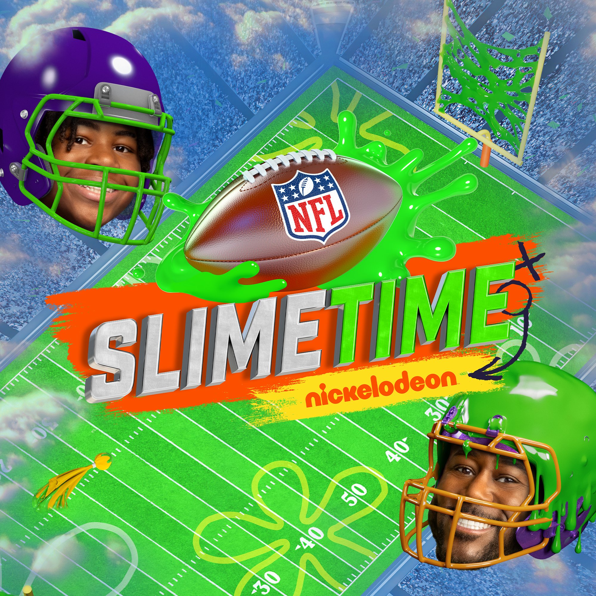
Nickelodeon’s NFL Slimetime keeps the game wild, weird, and wonderfully slimy. For Season 5, we brought that chaos to life in this commentary show’s key art. I designed a playful, high-energy composition that brings the Nickelodeon spirit to game day. The creative direction centered on blending NFL excitement with over-the-top, kid-friendly chaos — complete with flying slime, bold motion, and plenty of personality.
This year’s concept features SpongeBob and Sandy Cheeks joining the action with Sandy taking a WILD ride through the scene. We chose to feature. Young Dylan and Nate Burleson as bobbleheads adding a collectible, larger-than-life touch. The final piece bursts with color, texture, and energy, embodying the fun of football through Nickelodeon’s one-of-a-kind lens.
SVP, Creative Director: Vincent Aricco
SVP, Creative Director: Michael Waldron
Art Director: Alex Drake
Senior Graphic Designer: myself
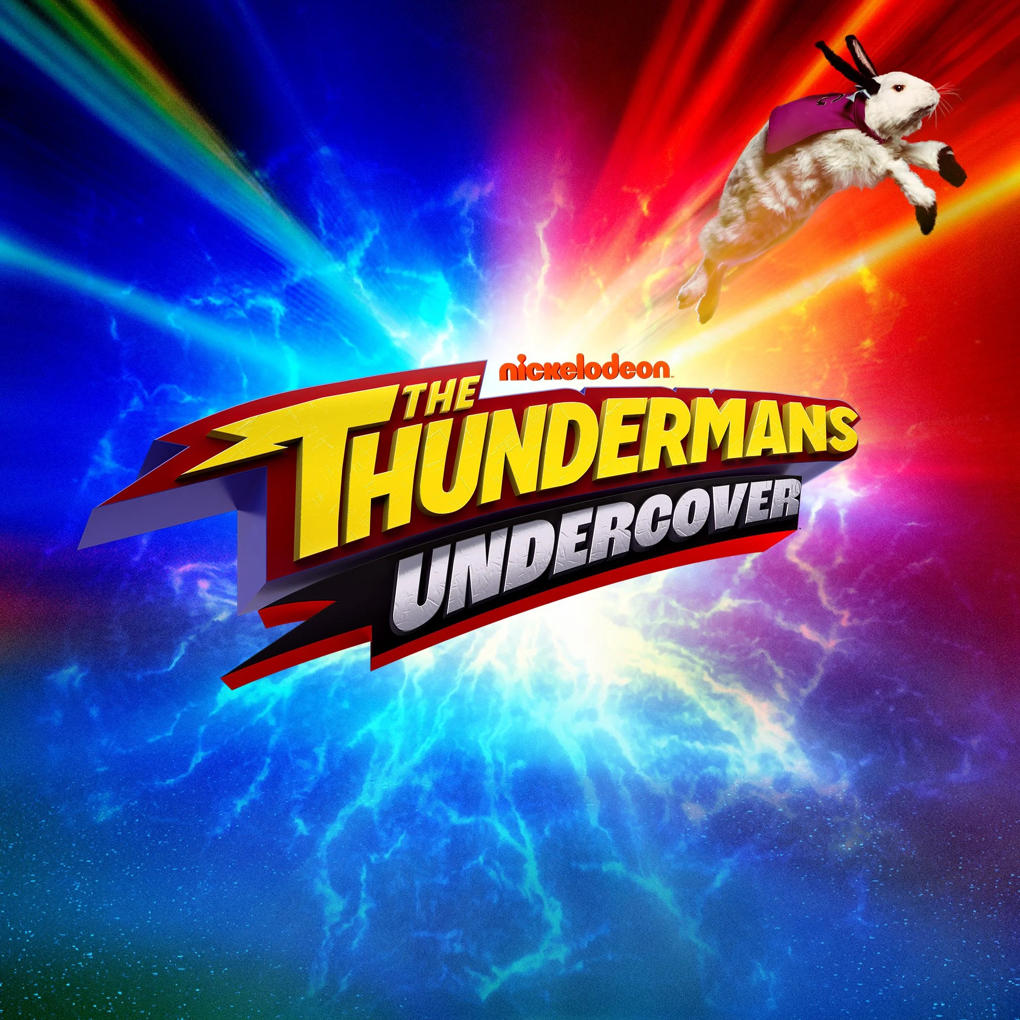
A spinoff sitcom of Nickelodeon’s beloved superhero series, The Thundermans Undercover follows the family’s return as they take on a new secret mission — with Chloe stepping into the spotlight to discover her powers and carry on the Thunderman legacy.
With limited assets available from previous Thundermans seasons, I crafted the key art using a mix of repurposed gallery photography and stock imagery. The creative challenge was to make the design feel fresh and dynamic while staying true to the show’s bold, heroic energy. The composition highlights Chloe as the new lead, supported by Phoebe and Max, against an electrified graphic backdrop that captures the excitement, action, and humor that define this next chapter in the Thundermans universe.
SVP, Creative Director: Vincent Aricco
SVP, Creative Director: Michael Waldron
Art Director: Alex Drake
Senior Graphic Designer: myself
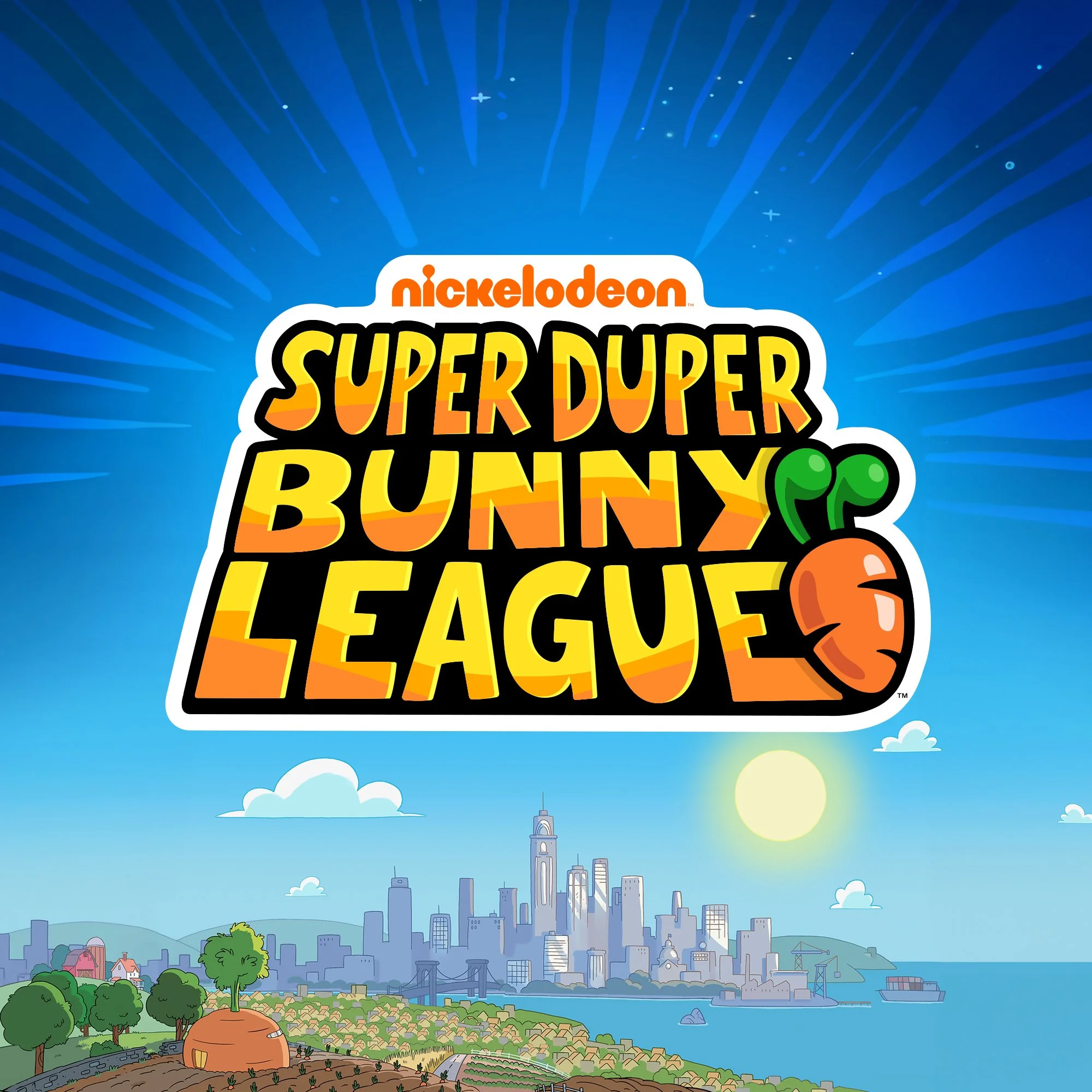
This preschool action comedy follows a fearless team of super-powered bunnies as they protect Important City from out-of-this-world villains, from lava monsters to space pirates and beyond.
For the key art, I aimed to capture that larger-than-life sense of teamwork and heroism at the heart of the show. Using character poses and background elements provided by the animation team, I created an extended composition that launches the bunnies into action above their city, a bold, high-flying moment that radiates energy, unity, and unstoppable fun.
SVP, Creative Director: Vincent Aricco
SVP, Creative Director: Michael Waldron
Art Director: Alex Drake
Senior Graphic Designer: myself
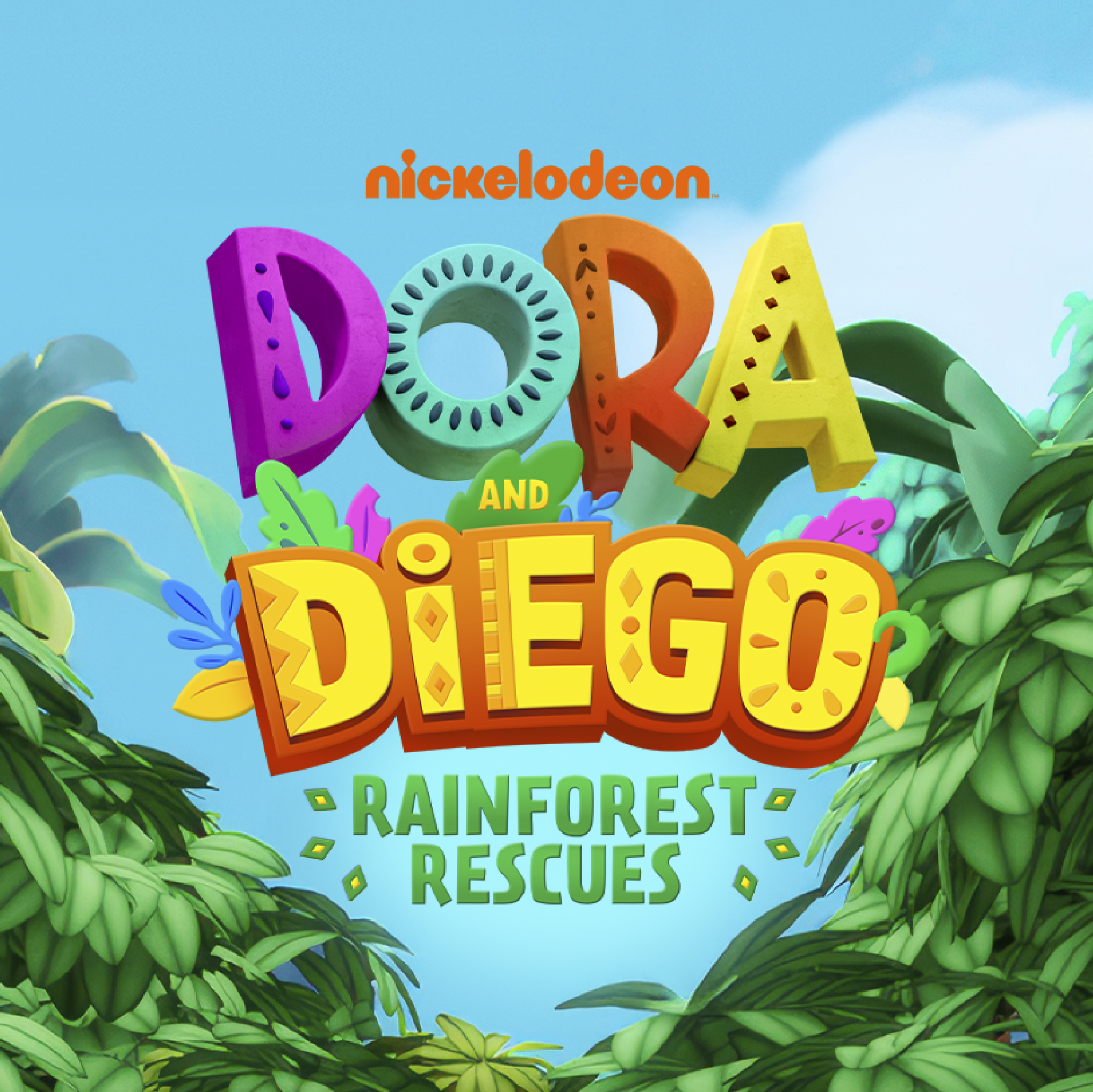
This hour-long special reunites Dora and her cousin Diego for a brand-new rainforest adventure, as they swing into action to help animals in need and meet Baby Jaguar for the first time.
We wanted the key art to feel just as adventurous and full of heart as the rescue team. Pulling dynamic character poses straight from the episode, we worked with the show team to secure high-res renders and composite them into a bold, motion-filled layout. The characters stand out among the sky as they soar on vines and invite the audience to help save rainforest animals in trouble.
SVP, Creative Director: Vincent Aricco
SVP, Creative Director: Michael Waldron
Art Director: Alex Drake
Senior Graphic Designer: myself
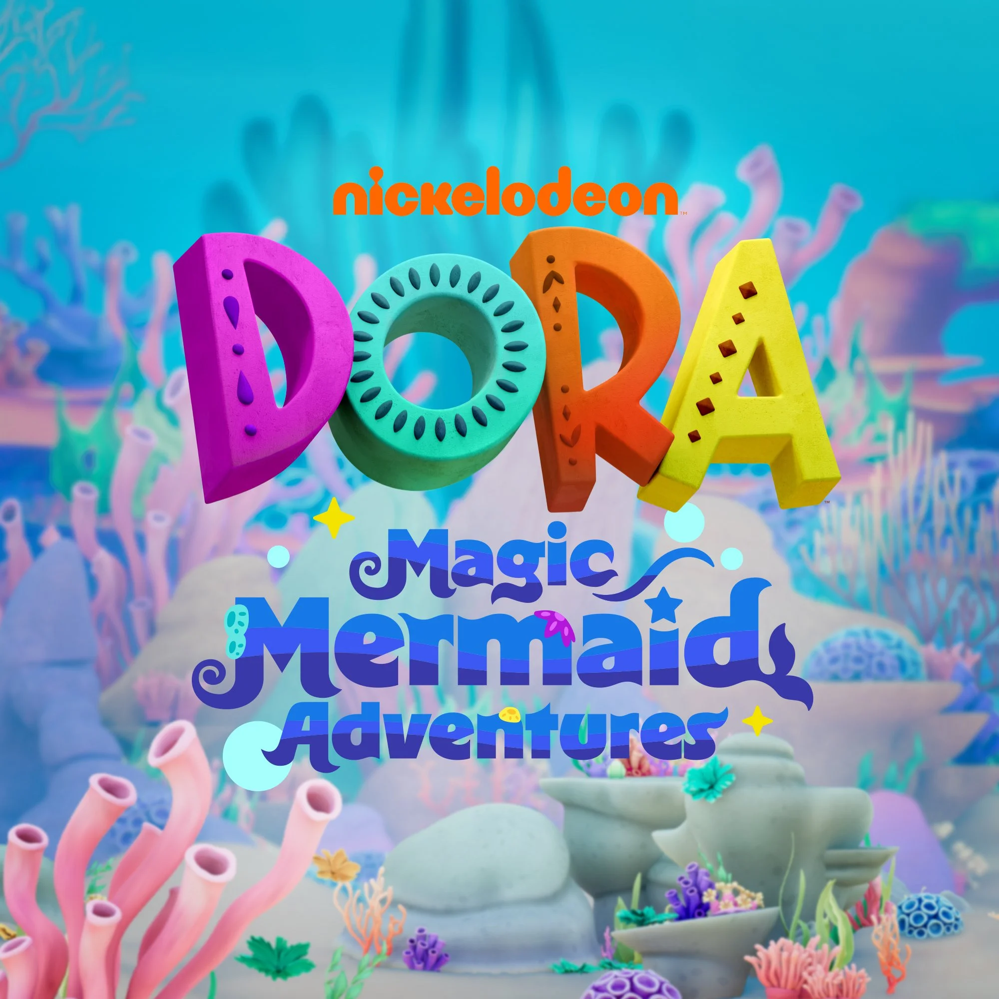
In this magical underwater special, Dora transforms into a mermaid and teams up with her new friends Marisol and Rosa for an ocean adventure full of curiosity, courage, and discovery.
We aimed for the key art to capture the same playful energy and movement that fills the special itself. We selected dynamic poses from the episode and built the composition using high-res renders of the characters and a bright, lively seascape. Dora, Boots, Marisol, and Rosa glide through colorful coral and swirling bubbles, embodying the heart, teamwork, and imagination that make Dora’s adventures magical.
SVP, Creative Director: Vincent Aricco
SVP, Creative Director: Michael Waldron
Art Director: Alex Drake
Senior Graphic Designer: myself
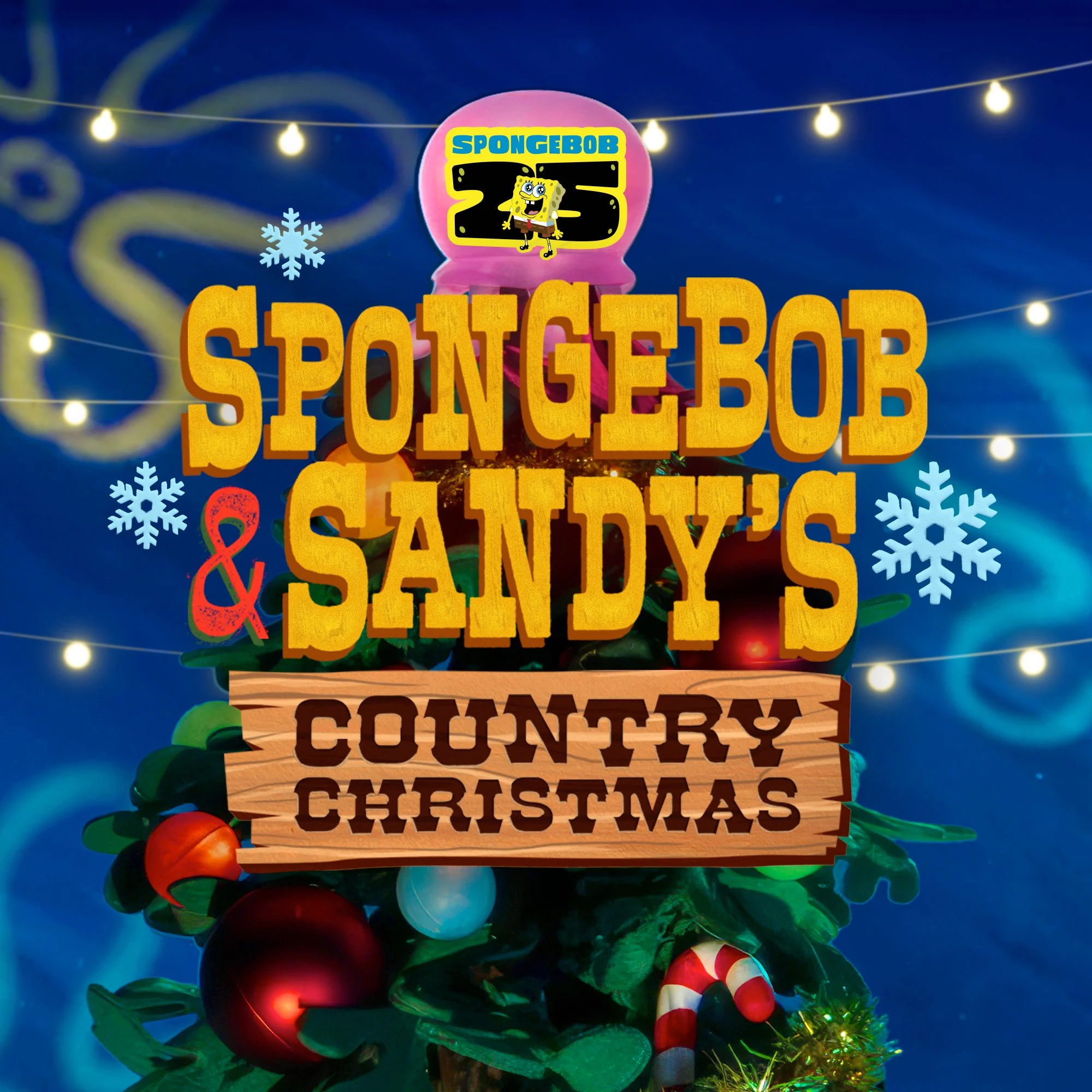
This festive stop-motion special brings SpongeBob and Sandy together for a holly-jolly adventure in Bikini Bottom—country style.
With limited assets to pull from, we relied on unit photography from the stop-motion shoot and a mix of stock elements to build out the composition. Our goal was to channel the handcrafted charm of the special itself, leaning into warm holiday textures, playful lighting, and cozy country details. The final key art captures the joy and goofiness of SpongeBob and Sandy’s Christmas spirit, wrapped up in a bright, celebratory scene that feels straight out of their underwater holiday.
SVP, Creative Director: Vincent Aricco
SVP, Creative Director: Michael Waldron
Art Director: Alex Drake
Senior Graphic Designer: myself
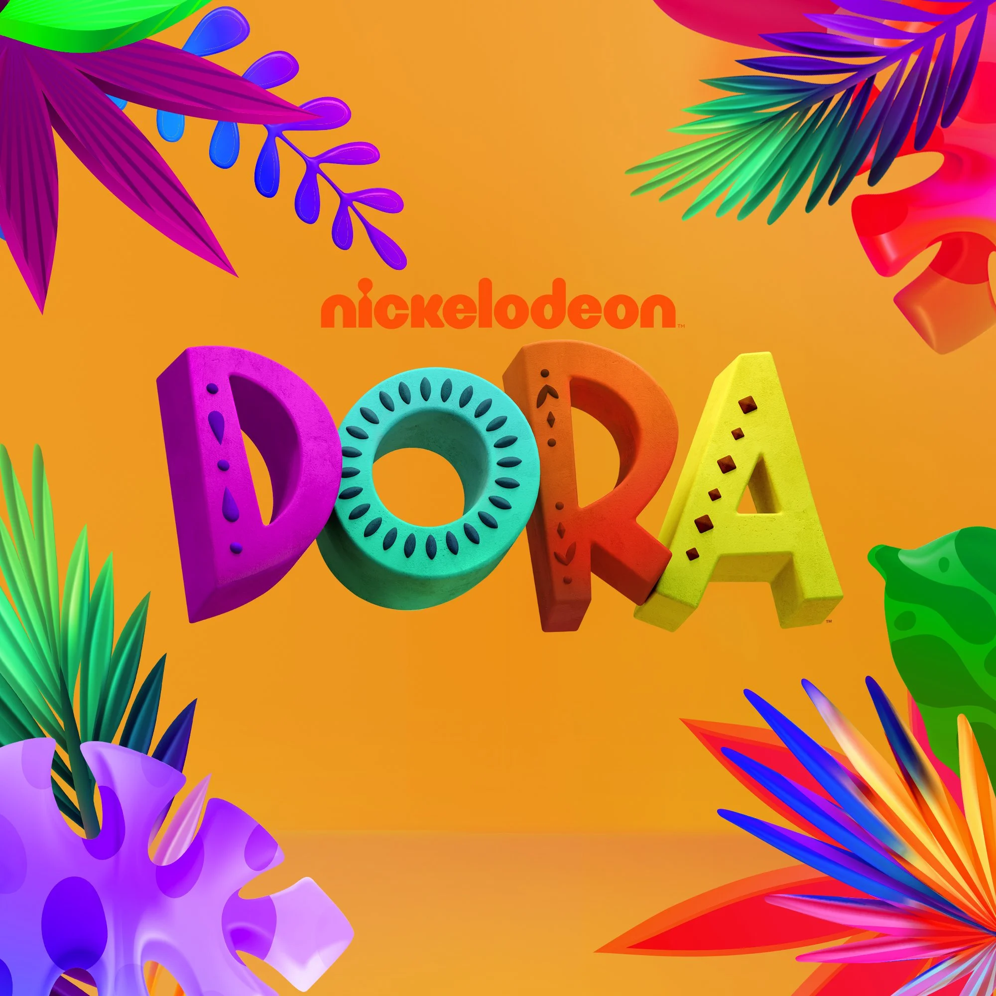
With all-new CG animation and imaginative character-driven storylines, the series follows everyone's favorite bilingual explorer, Dora, and her best monkey friend, Boots, as they embark on epic adventures in a fantastical rainforest.
Following Dora Season 1’s key art that featured the whole cast in their environment, the goal for Season 2 was to focus on the iconic duo, Dora and Boots. We placed them against this graphic, lush world of colorful 3D leaves so they would pop from 100 ft away on a billboard over Sunset Blvd. The eye-catching art was adapted across all media platforms such as Paramount+, digital, and OOH.
SVP, Creative Director: Vincent Aricco
SVP, Creative Director: Michael Waldron
Art Director: Alex Drake
Senior Graphic Designer: myself
For the third season of this international adventure series, we set out to create key art that felt more cinematic and story-driven than in previous years.
We drew inspiration from the season’s storyline that follows Taylor’s search for her missing explorer uncle leaves her trapped alongside him in an alternate world. Her friends must continue the search following the clues to uncover the mystery and set them free. We built a composition that balances sunlit island beauty with darker, otherworldly intrigue using a combination of gallery photography captured on set and stock imagery. We leaned into the show’s adventurous tone and the result feels elevated yet true to the show’s spirit: a seamless blend of friendship, mystery, and discovery.
SVP, Creative Director: Vincent Aricco
SVP, Creative Director: Michael Waldron
Art Director: Alex Drake
Senior Graphic Designer: myself
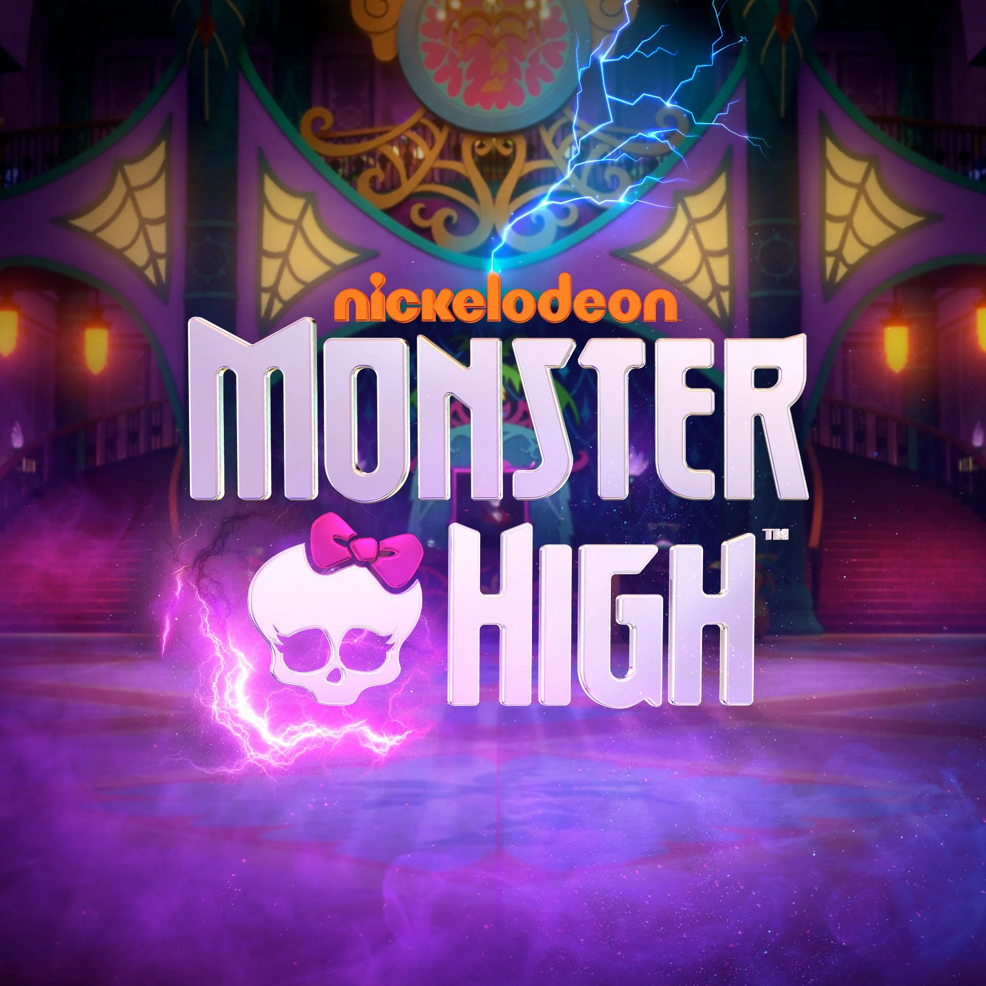
For the second season of Monster High, we wanted the key art to reflect the bold, electric energy of the franchise while showcasing the cast and their powers in a fun, new way.
We composited each character pose into a vibrant, layered scene that highlights their unique powers and personalities, adding glowing effects, lightning, and atmosphere to emphasize the supernatural flair of the world. The horizontal layout allowed us to extend the group and give every monster their moment to shine thus capturing the friendship, confidence, and fun that define Monster High.
Before season one, I also had the opportunity to design brand new look for the Monster High logo that we brought into this seasons key art. I utilized Cinema 4D to give the lettering a subtle extrude and an iridescent texture that reflected the colors and feel of the show.
SVP, Creative Director: Vincent Aricco
SVP, Creative Director: Michael Waldron
Art Director: Alex Drake
Senior Graphic Designer: myself
For this season’s key art, we aimed to capture the intensity and scale of the Transformers: EarthSpark universe while spotlighting the human heroes at its heart.
The composition centers on siblings Mo and Robby, caught mid-action as they charge into the chaos alongside Optimus Prime, Bumblebee, Thrash and Twitch. Maintaining proper scale between characters was essential to preserving authenticity, while still keeping the focus on human connection and courage. I extended the cavernous background by stitching together multiple pieces of background art to create a more expansive environment, enhanced with lightning effects and glowing energy bursts to amplify the sense of motion and power.
SVP, Creative Director: Vincent Aricco
SVP, Creative Director: Michael Waldron
Art Director: Alex Drake
Senior Graphic Designer: myself
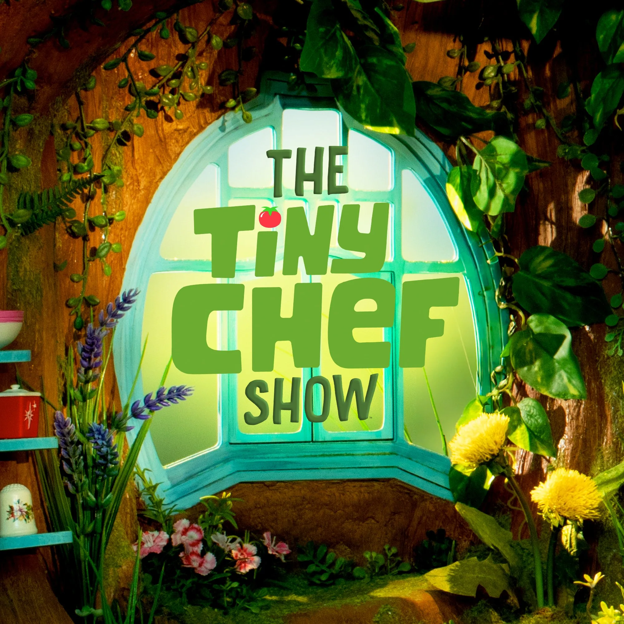
This season continues to celebrate the joy of cooking, the fun of friendship, and the magic of Chef’s tiny world all stirred together with plenty of heart and humor.
We wanted the key art to capture the cozy, handcrafted world that makes Tiny Chef so special. Set inside his iconic stump kitchen, we featured Chef and his sidekicks surrounded by their colorful tools, textures, and ingredients. Pulling from the stop-motion set photography, we built a warm, storybook-like composition that highlights the charm, whimsy, and love that go into every tiny meal.
SVP, Creative Director: Vincent Aricco
SVP, Creative Director: Michael Waldron
Art Director: Alex Drake
Senior Graphic Designer: myself
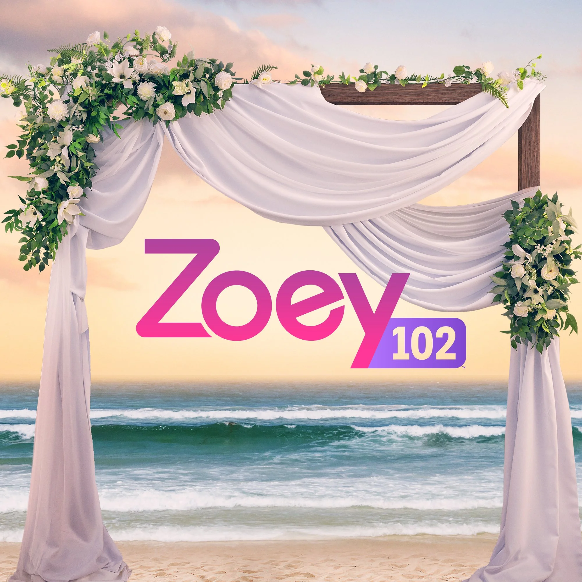
For the highly anticipated Zoey 101 reunion movie, I was tasked with designing the Zoey 102 logo. The goal was to modernize the nostalgic original with a more elevated, mature feel that reflects the characters’ growth while staying true to the series’ playful roots.
The film reunites the PCA crew for a wedding, setting the stage for a blend of heartfelt nostalgia and comedic chaos. I assisted in art direction during the key art photoshoot, helping guide character posing and overall tone to capture the chemistry and complicated dynamic of the cast. The final piece developed with the help of Canyon Design Group, strikes a balance between sophistication and familiarity bringing the world of Zoey 101 back to life for a new era.
Agency: Canyon Design Group
SVP, Creative Director: Vincent Aricco
SVP, Creative Director: Michael Waldron
Art Director: Alex Drake
Senior Graphic Designer: myself
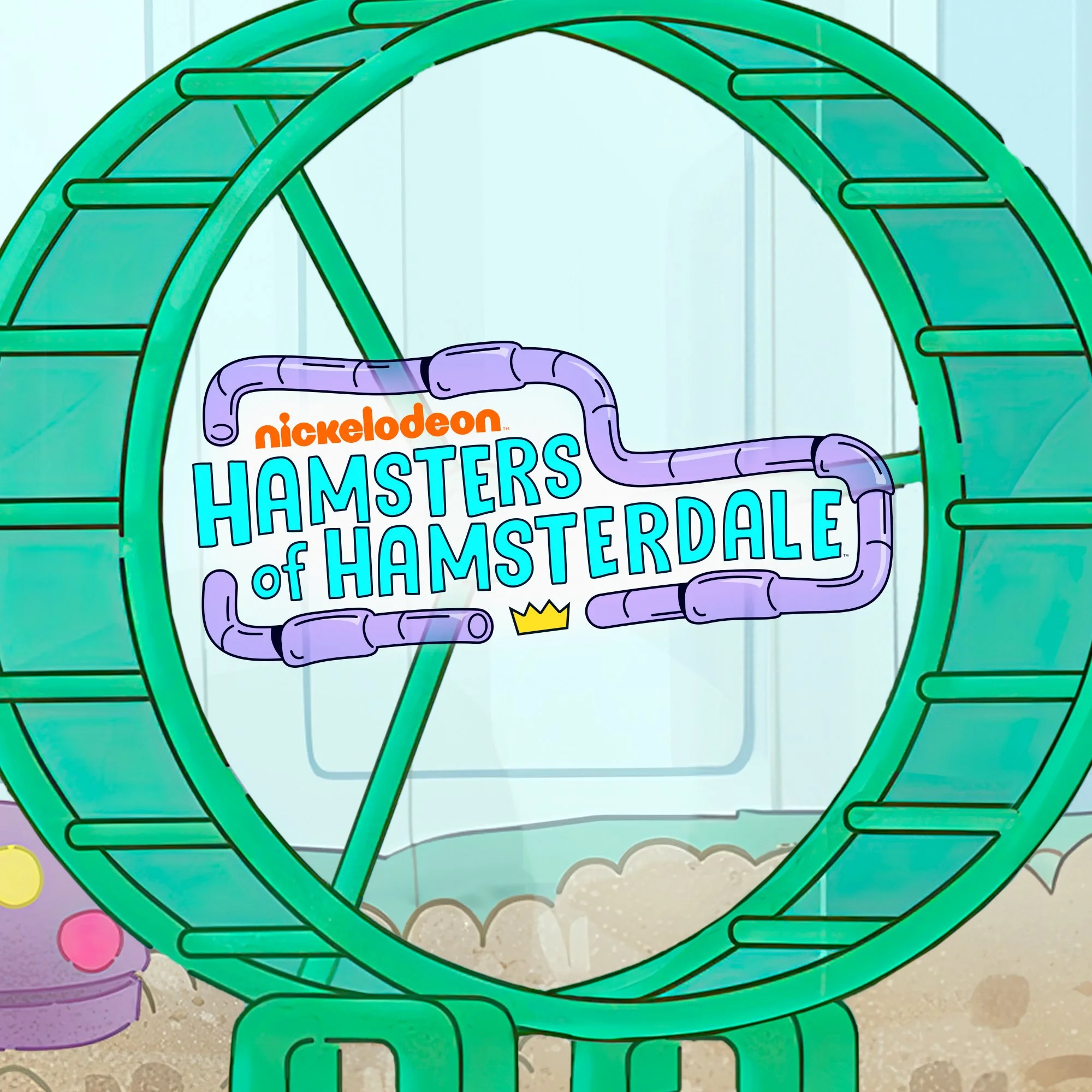
This show follows a motley crew of hamsters who believe their 8-year-old owner Harry is a king —and they’re the heroic protectors of his “tubed” kingdom.
For the key art, our goal was to capture the playful action-packed tone of their subterranean adventures while breaking the fourth wall to invite the viewer in. Tasked with featuring the full cast, we posed each hamster to reflect their quirky personality. Bright, bold colors and kinetic movement reflect the show’s high energy and comedic sense of mission.
SVP, Creative Director: Vincent Aricco
SVP, Creative Director: Michael Waldron
VP, Creative Director: Sandy Goijburg
Art Director: Alex Drake
Senior Graphic Designer: myself
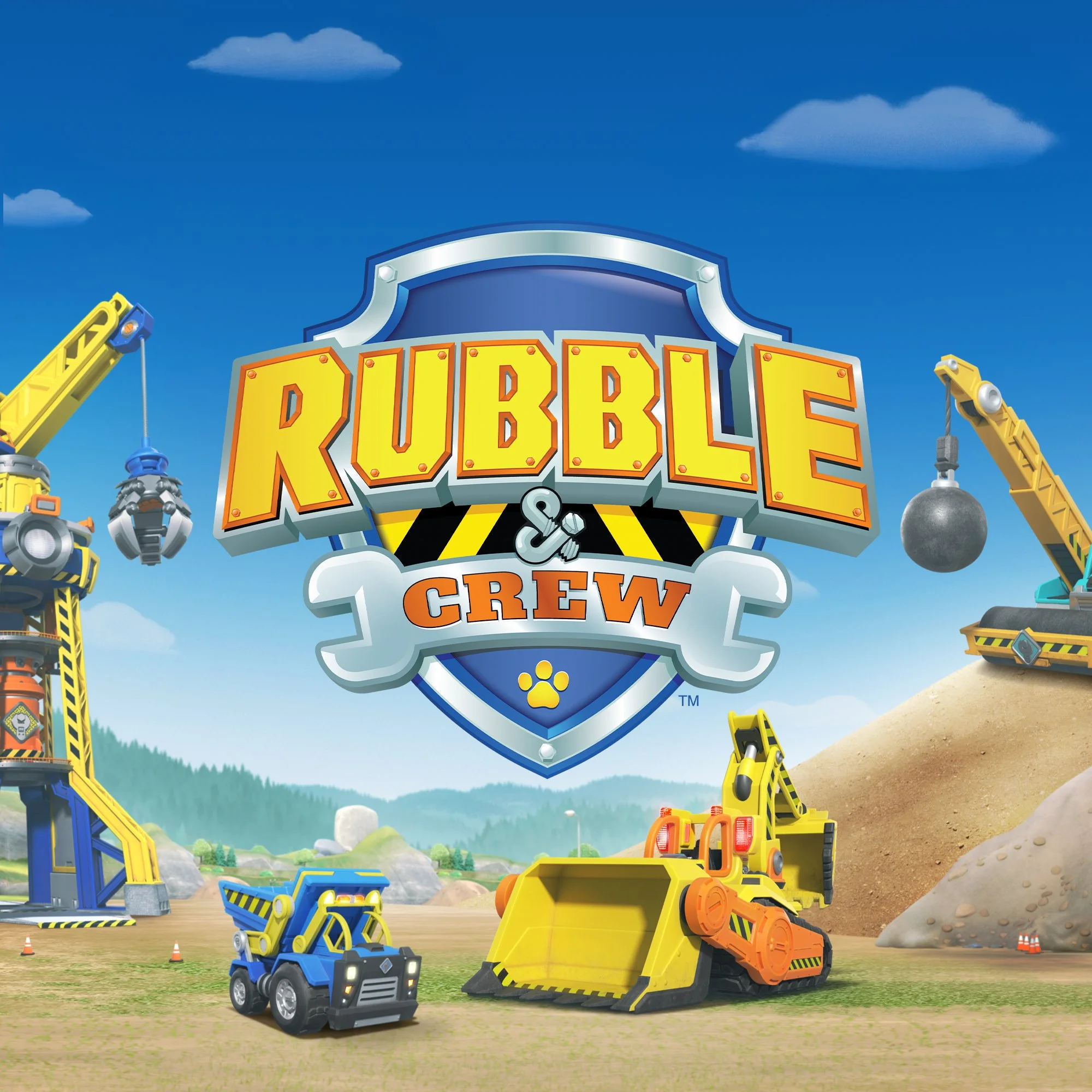
This series follows Rubble and his family of construction pups as they tackle new building adventures together in Builder Cove.
For this season’s key art, we featured the full crew with Rubble leading the charge at their construction site. Working with the show team, we developed poses that highlight each pup’s personality and teamwork while incorporating their vehicles without overcrowding the composition. The result is a bright, energetic piece that captures the fun and heart of Rubble & Crew.
SVP, Creative Director: Michael Waldron
VP, Creative Director: Sandy Goijburg
Art Director: Alex Drake
Senior Graphic Designer: myself and Cassie Navarro
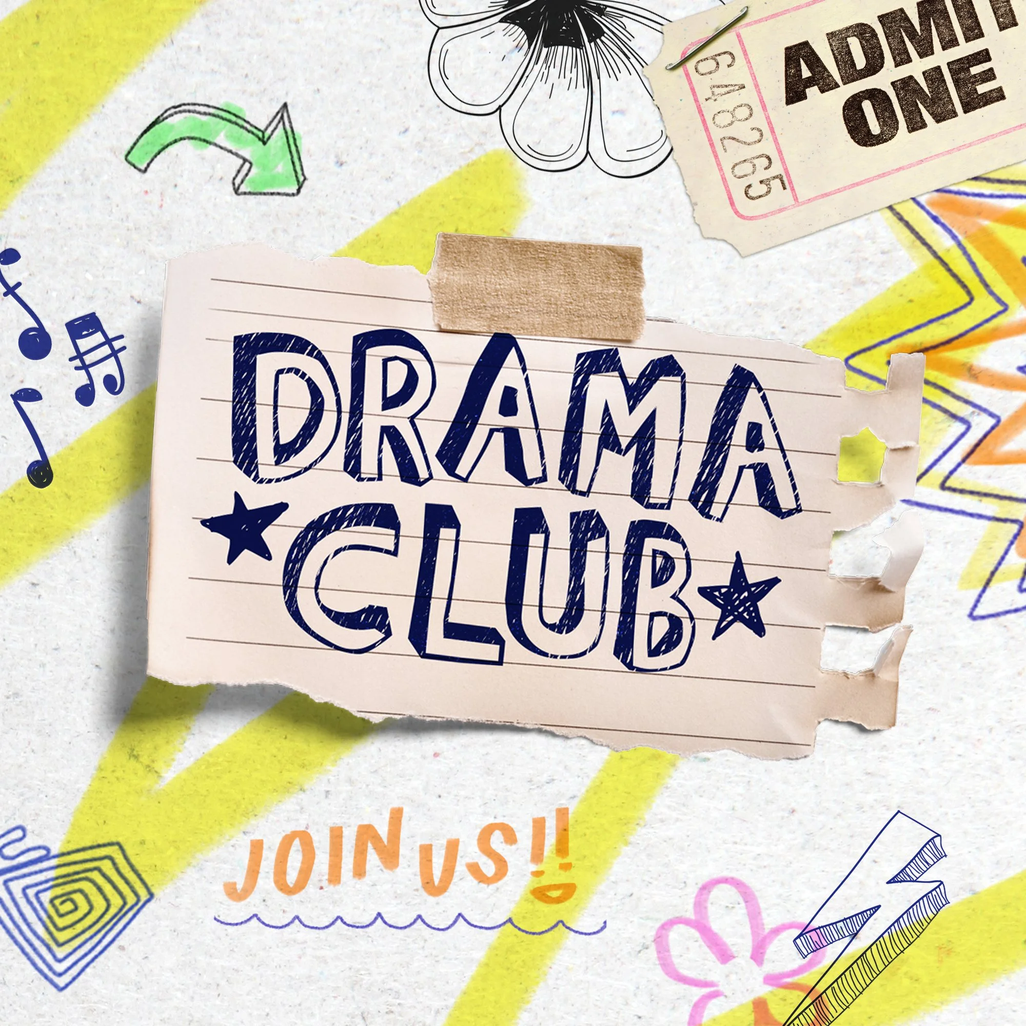
Drama Club is about a group of middle school students who shine a light on the inner workings of its school's overlooked drama club. This key art celebrates the quirky charm and creative chaos of the Drama Club.
Designed to look like a handmade school flyer, the layout combines character photography with playful doodles and taped notebook textures—mimicking something the students themselves might post on a hallway bulletin board. Each illustrated element hints at the characters’ personalities and their roles within the club, bringing an authentic, student-made energy to the piece. As my first key art project built entirely from scratch at Nickelodeon, it remains one of my most meaningful and memorable designs.
SVP, Creative Director: Michael Waldron
VP, Creative Director: Sandy Goijburg
Creative Director: Ana Bustios-Tuesta
Art Director: Alex Drake
Senior Graphic Designer: myself
I designed this logo for Honor Society, a Paramount+ original film about ambition, rivalry, and the pursuit of perfection in high school.
The logo blends a subtle collegiate influence with a modern, youthful energy—reflecting the film’s balance of sharp wit and academic pressure. Its clean serif and structured layout evoke classic university design, while the bright color palette keeps it playful and contemporary. The logo was crafted to work effectively both in full color and as a single-color treatment, maintaining legibility across marketing formats. It also integrates seamlessly with the key art, complementing the stacked name credits above and the bold, character-driven composition below.